Reports
Widgets
Widgets are the building blocks of a report. There's one for every common visualisation you'll want.
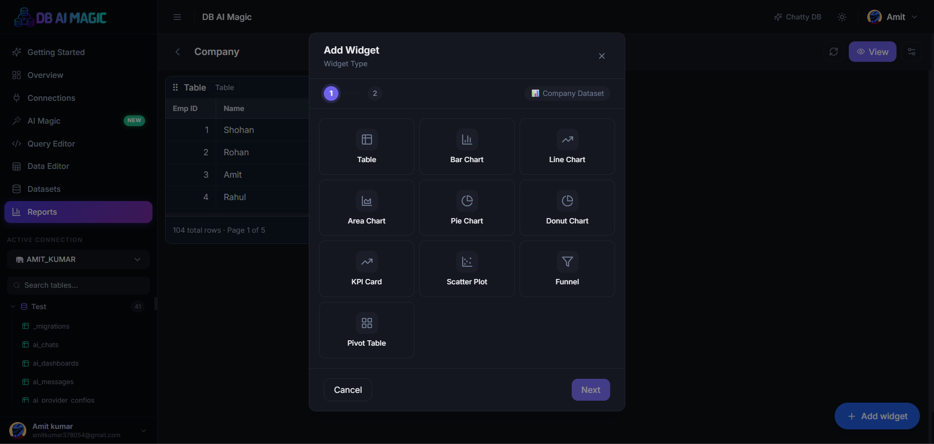
Every widget points at a dataset and renders a single view of the data. Add as many as you want, mix types freely, and resize individually.
KPI tile
A big-number tile for headline metrics: total revenue, active users, conversion rate. Optionally show a trend arrow compared to a previous period.
- Value column — what to display
- Aggregation — sum, avg, min, max, count
- Format — number, currency, percent
- Comparison — vs. previous period, vs. target
Table
A tabular view of the dataset. Sortable columns, pagination, search, and column visibility toggles for readers. Great for “Top 50 accounts”-style widgets.
Chart
DB AI Magic auto-picks a sensible chart type from the columns you select, but you can override:
- Line — trends over time
- Bar / Column — categorical comparisons
- Area — cumulative trends
- Pie / Donut — composition (use sparingly)
- Scatter — correlation between two numeric columns
- Heatmap — magnitude across two categories
- Stacked bar — composition over time or category
Per-chart configuration
For each chart you can configure axes, series, colours, legend position, and value labels. Charts inherit their colour palette from your workspace theme but you can override per-widget.
Text / Markdown
Drop a markdown block onto the grid to add context — a description, a methodology note, a link to a runbook. Text widgets render in public reports too, so they're a good place for the “data caveats” paragraph.
Filter slicer
A standalone widget that exposes one of the report's filters inline (instead of, or in addition to, the top filter bar). Useful for dashboards where the filter is a primary navigation control.
Best practices
Less is more
- Group related widgets in the same row
- Put the most important KPI top-left — eye lands there first
- Use consistent colours for the same dimension across widgets
- Annotate non-obvious metrics with a text widget below them